Hi, I'm Thomas & I Build
Clean, Credible, Client-Getting Websites
Hi, I'm Thomas & I Build
Clean, Credible, Client-Getting Websites

15+
Years Experience
400+
Websites Launched
15+
Years Experience
400+
Websites Launched
Hi... Do you want a website that:
Gets Potential Clients to take you seriously?
Enhances your Reputation so you can charge more?
Shortens your Sales Cycle by inspiring your prospects to trust you more and work with you sooner rather than later?
Or maybe your former designer messed up your website and you now want to level up and work with pros.
If this sounds like you, then you're in the right place.

Who is Tom?
Hey there, I’m Tom, a web designer with 15 years of experience under my belt. That’s right, I’ve been designing websites longer than most people have been using the internet (okay, maybe not that long, but you get the point).
Back in 2009 when I was just a wee intern studying computer science, I built my first website… a fancy web application for the Department of Immigration, and it was love at first byte.
As time went on, I kept making more websites, but I realized my true passion was making things look pretty. So, I specialized in web design and became a pro at making sites that were easy on the eyes.
So why even consider me?
I only breath Websites here – So I don’t do Mobile Apps, Web apps, Software or anything else. Instead you get 15+ years of razor-sharp webdesign skills ready to build your dream website.
Don’t worry, you won’t be my first… I’ve done this 400+ times now, so I got you 👍
Some of my Clients have included:


Fun Fact...
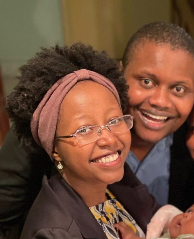
My wife Bakhita and I are the proud parents of a cute little bundle of joy.
When we’re not busy changing diapers and soothing our baby to sleep, we’re on the road exploring new local spots that inspire us and get our creative juices flowing.
Who knows, maybe we’ll end up starting a diaper-changing and road-tripping vlog – stay tuned!
If you’re ready to get started,
Sample Works
Sample Works
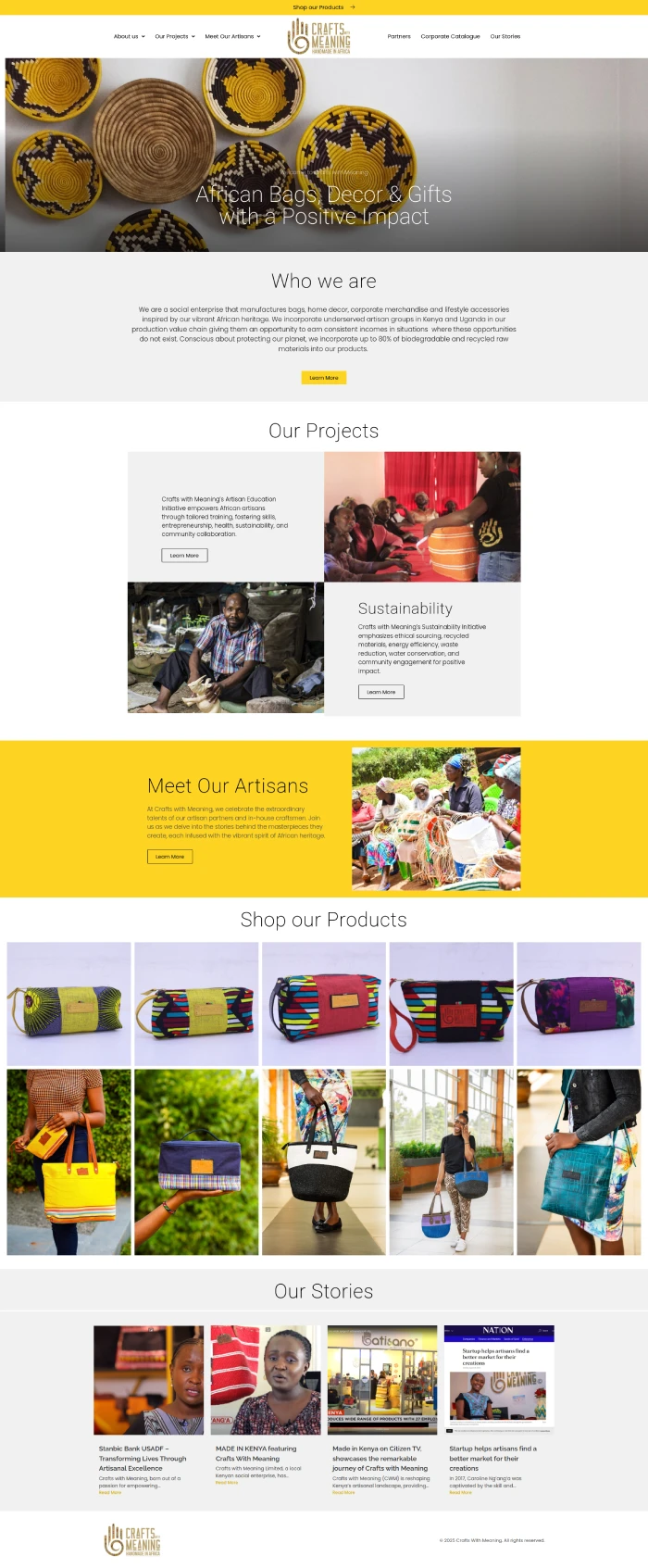
CRAFTS WITH MEANING (CWM)
Social Enterprise
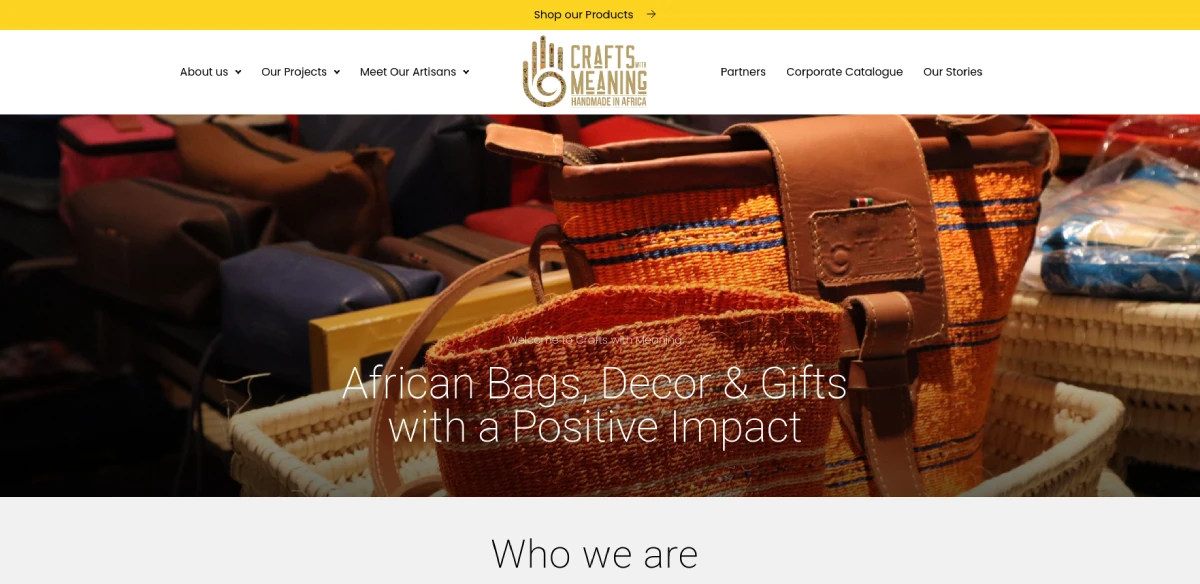
From Invisible to Irresistible: How Crafts With Meaning Transformed Their Online Presence
Crafts With Meaning (CWM) creates stunning African-inspired bags, home decor, and corporate merchandise—each piece telling a story, each sale fueling impact.
But their website? It wasn’t selling.
They needed more than just a beautiful online presence. They needed a website that would:
✔ Attract traffic and drive it to their online shop.
✔ Captivate corporate partners and drive bulk orders.
✔ Highlight their artisans, making their mission irresistible to socially consus brands.
That’s exactly what I delivered.
Their site now communicates and inspires.
Click here to check out the website.
And here’s the best part: Your company or organization could be next.
If your website isn’t working for you, let’s fix that.
Click here to Book Your FREE Website Consultation Right Now.

"I like the ongoing Website support and maintenance”
I liked Tom’s webdesign processes and the weekly zoom meetings which kept him accountable on the work.
Plus I liked the fact that once he is done launching the website he provides ongoing support and updates for the website which gives me peace of mind.
Pastor Samson Kiriinya
Taveta Children Assistance
PREMIER REALTY
Land and Property Sales
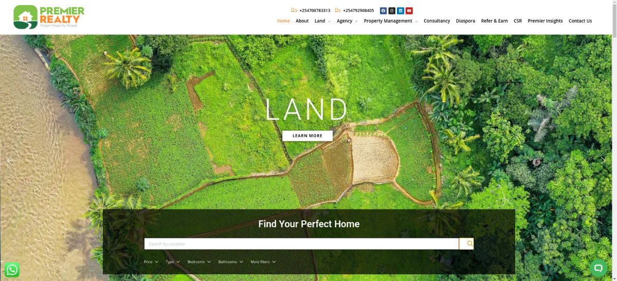
From Outdated to Outstanding: How Premier Realty’s Website Improved Customers Experience.
What happens when a real estate company’s website isn’t working for them?
Lost leads, frustrated clients, and missed opportunities.
That’s exactly what Premier Realty Limited (PRL) was facing. Their outdated site wasn’t just an eyesore—it was costing them business. No search tools, no client engagement, no real way to showcase their properties.
So they booked a free consultation with me.
We built them a high-converting, lead-generating powerhouse with:
✔ A sleek, modern design in their signature green & white.
✔ A powerful property search tool so buyers can find homes easily.
✔ A compelling showcase for flagship properties and client testimonials.
✔ Seamless CRM integration with Zoho to capture and manage leads effortlessly.
Now, PRL’s website isn’t just “online.” It sells, engages, and converts.
Click here to check out the website.
Is your website doing the same? If not, let’s change that.
Click here to Book Your FREE Website Consultation Right Now.


"They got my concept before we even started coding"
I liked that Thomas and Bakhita had a clear process that guides one step by step, it’s really easy to understand and gave me a structure that I referred to over and over again during the project. It’s especially good for people who are very busy.
We also had an initial sketching session that was really clarifying in that it helped me to know that they had gotten my concept before we even started the design.
They also didn’t fall too much in love with their design or wording like most creatives and instead were able to take in my inputs without seeing it as a critique.
Susan Kiamba
Career Clarity Coach
Kiguatha & Company Advocates
Law Firm Website Design
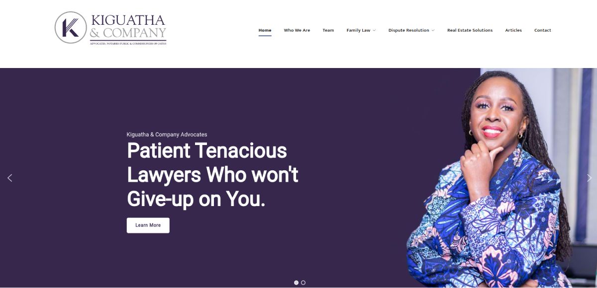
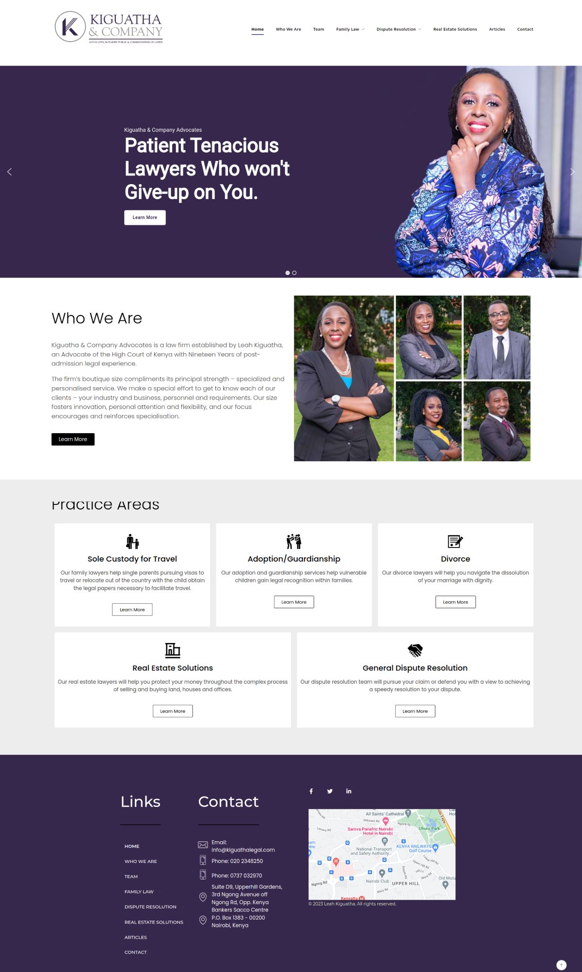
From Vision to Reality: How Kiguatha Legal’s Website Became a Client Magnet
When Leah first approached me, she had a clear vision—she wanted a website that truly reflected her family law, dispute resolution, and real estate practice.
She loved her branding and wanted a website that would seamlessly align with it.
So, we got to work.
✔ Warm, inviting visuals—captured with our photographer to set the right tone.
✔ A professional yet reassuring design—so clients feel at ease from the first click.
✔ A brand-aligned look—ensuring her online presence is polished and cohesive.
The result? Kiguatha Legal’s website now exudes credibility, warmth, and professionalism—making it effortless for potential clients to trust and engage with her firm.
Click here to check out the website.
Your website should do the same. Let’s create a digital presence that truly represents you.
Click here to Book Your FREE Website Consultation Right Now.

"Frustrated By Our Previous Developer & Rescued By Thomas"
After being disappointed with our previous developer we were so frustrated and we had fallen behind schedule that we needed a miracle and quickly.
Thomas provided that miracle because in 2 weeks we were back on track, mind you this was after we had wasted a full 6 months.
Charles Odinga
Radioson Consult
ATISANO
Online Shop
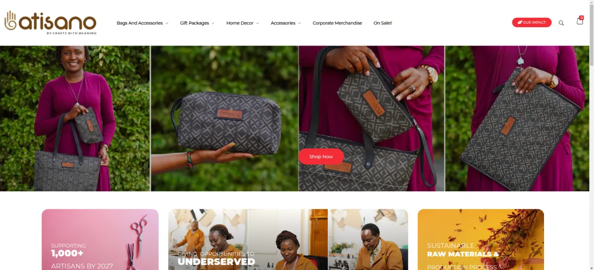
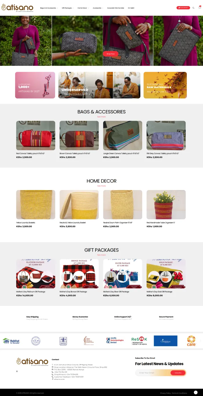
From Local Shop to Global Sales: How Atisano’s Website Became a 24/7 Sales Machine
Atisano, a Kenyan brand specializing in bags, accessories, gift packages, home decor, and corporate merchandise, had a thriving physical shop—but they wanted more.
They needed a website that sells, not just a digital brochure. Their goal? Expand online sales in Kenya and the UK, tapping into two different markets with localized pricing and shipping options.
Here’s what I delivered:
✔ A sleek, conversion-focused store that attracts and sells effortlessly.
✔ A seamless checkout system with dual currency and location-based shipping fees.
✔ A design that makes Kenyan and UK buyers feel right at home.
Now, Atisano isn’t just a local shop—it’s a global brand.
Their website sells 24/7, reaching customers beyond borders.
Click here to check out the website.
Is your website working this hard for you?
Click here to Book Your FREE Website Consultation Right Now.

"I Liked Tom's Process & Workflow"
I cannot praise Tom’s services enough! From the moment we engaged him to work on our website, we were blown away by his outstanding availability and unwavering commitment to excellence.
Moreover, Tom’s communication throughout the entire process was exemplary. He was always responsive, promptly addressing any questions or concerns we had. It felt like we were working with a true partner who was as invested in our project as we were.
Throughout the entire project, he demonstrated a level of professionalism that is rare to find.
Stephen Kamaara
P.M. Kamaara & Associates Advocates
SUSAN KIAMBA
Career clarity coach Website Design
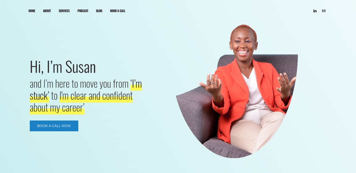
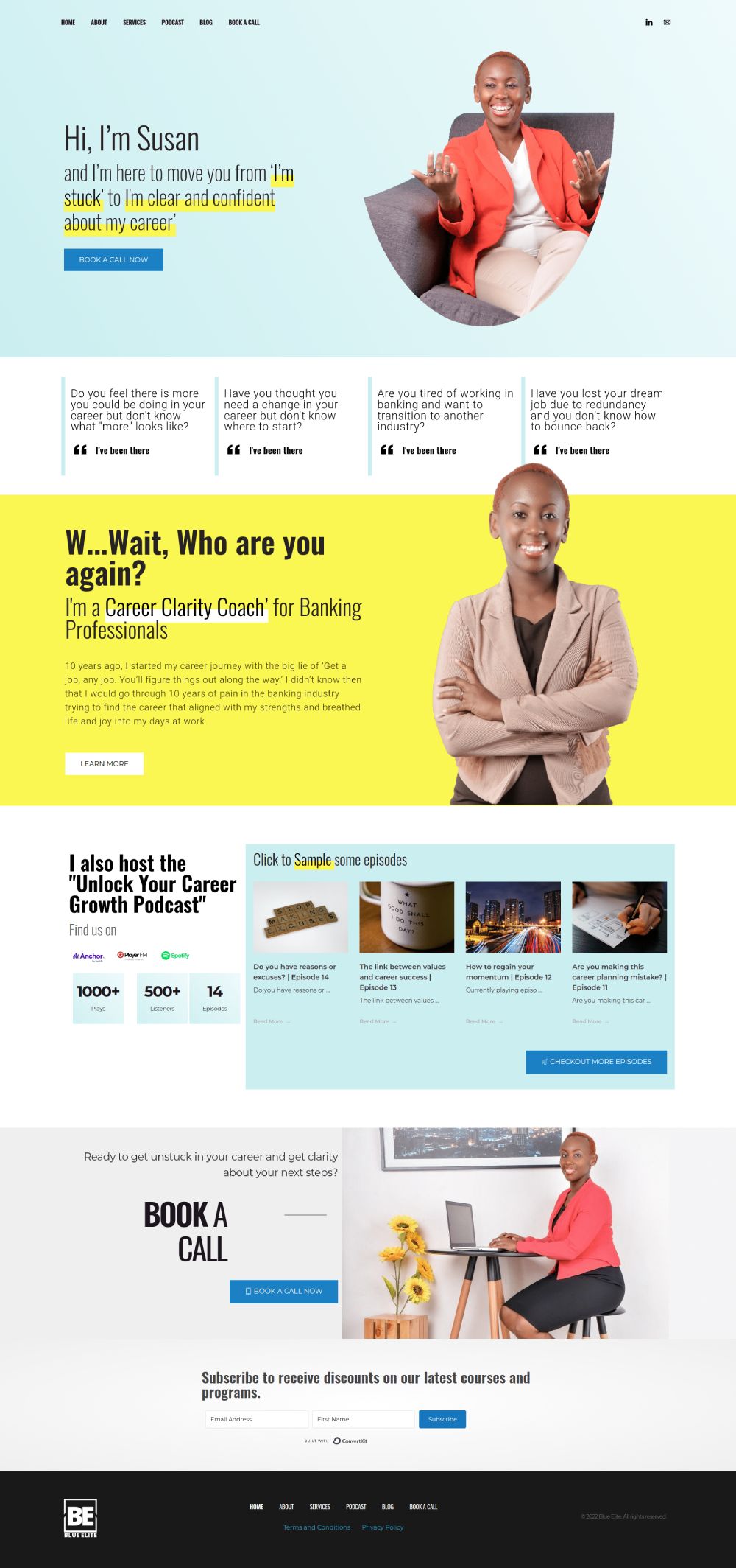
From Uncertainty to Ownership: How Susan Kiamba Built Her Digital Home
Susan knew exactly what she wanted—a dedicated online space that she fully controlled, without relying on the ever-changing landscape of social media.
So, we got to work.
✔ A deep-dive Zoom session to understand her vision, preferences, and inspirations.
✔ A beautifully crafted design that reflects her expertise and connects with her audience.
✔ A professional, independent platform that gives her full ownership of her brand online.
Now, SusanKiamba.com is live—a polished, strategic, and powerful digital presence that works for her 24/7.
No more algorithm changes. No more platform risks. Just a website that truly represents her.
Click here to check out the website.
Isn’t it time you took full control of your online presence?
Let’s build your digital home. Book a call today.
Click here to Book Your FREE Website Consultation Right Now.

“Thomas listened and gave us exactly what we were looking for”
When we first started working with Thomas we knew we were very particular about what we wanted. We spent our first session looking at other websites that we liked and pointing out exactly what we liked about them.
When we saw our initial design one week latter we were so excited coz Tom had achieved the effect we we’re going for.
Carol Koskei
Triple Ell Property
Parker Russell Eastern Africa
audit and accounting firm
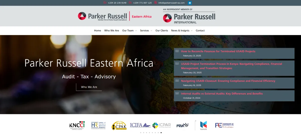
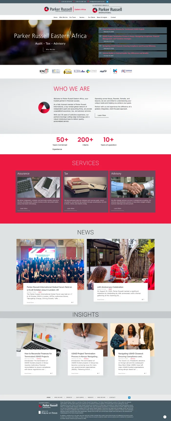
From Generic to Global: How Parker Russell Eastern Africa’s Website Got a Powerful Rebrand
When Parker Russell Eastern Africa (PREA) approached me, they needed more than just a website update—they needed a global-caliber rebrand that aligned with Parker Russell International’s high standards.
The challenge?
✔ Strict branding guidelines that had to match the global firm’s identity.
✔ A design that felt polished, professional, and authoritative.
✔ Local imagery that still resonated with the Eastern Africa team.
We delivered a visually stunning, brand-aligned website that blends global prestige with a regional touch. The result? A powerful online presence that reflects PREA’s standing in the audit, tax, and advisory space.
Now, Parker Russell Eastern Africa’s website isn’t just a digital placeholder—it’s a trust-building, client-winning asset.
Click here to check out the website.
Does your website reflect your expertise and credibility? If not, let’s fix that.
Click here to Book Your FREE Website Consultation Right Now.

"Thomas kept to the agreed upon timeline”
I liked the consistent communication we had during the project and the weekly review meetings on zoom.
Thomas kept to the agreed upon timeline which was new to me since most people I know, don’t stick to their timelines and you end up chasing after them to complete projects. I love my new website and the video gives it a nice unique look as well.
Adrian Kimani
CLGL
VITAL SOLUTIONS
Leadership & Sales Training
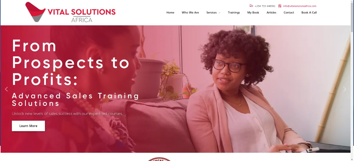
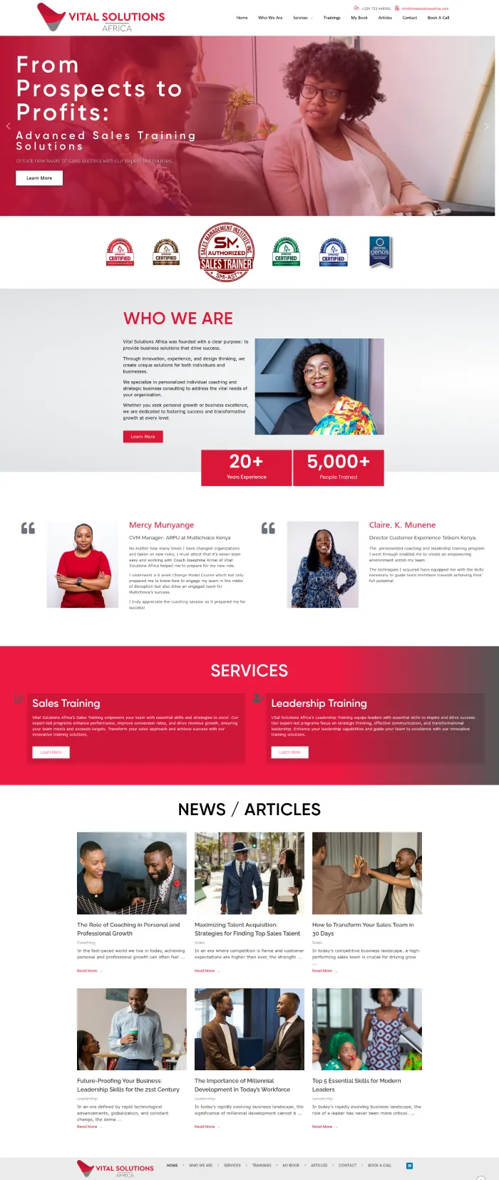
From Static to Strategic: How Vital Solutions Africa’s Website Became a Client-Attracting Powerhouse
Vital Solutions Africa didn’t want a website that just sat there looking pretty.
They needed a sales-driven platform—one that pulled in corporate clients, engaged young professionals, and drove action.
No fluff. Just results.
So, we built them a clean, sharp, high-impact website that:
✔ Captivates at first glance with powerful visuals and a sleek, professional design.
✔ Engages the right audience—corporates and young professionals alike.
✔ Drives action effortlessly with clear calls to contact and convert.
Now, Vital Solutions’ website isn’t just online—it’s working.
Click here to check out the website.
Your website should do the same. Let’s turn it into a client-attracting, revenue-generating asset.
Click here to Book Your FREE Website Consultation Right Now.
"We didn't need to keep following up with Thomas to do our work”
Thomas was very Professional in his work. We didn’t need to keep following up with him to do our work since he kept informing us on how far he’d gone every step of the way.
Ishmael Ochieng’
Shelter of Hope Foundation
KM&M Advocates LLP
Law Firm
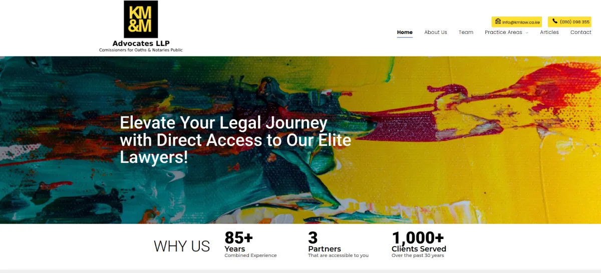
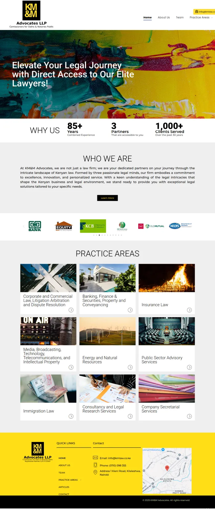
From Bland to Bold: How KM&M Advocates’ Website Became a Standout Digital Presence
When KM&M Advocates approached me, they didn’t want just another law firm website.
They wanted something bright, colorful, and effortlessly readable—a site that felt liberal, engaging, and authoritative all at once.
So, we experimented. We played with colors, layouts, and design elements until we created a perfect balance:
✔ Vibrant yet professional—a fresh take on law firm branding.
✔ Easy to navigate—because clarity converts.
✔ A site that says, “We know our stuff.”
Now, KM&M’s website doesn’t just exist—it stands out. It’s bold, inviting, and most importantly, built to impress.
Click here to check out the website.
If your website doesn’t reflect the expertise and personality of your firm, let’s change that.
Click here to Book Your FREE Website Consultation Right Now.

"Tom took a look at my website and showed me exactly how I could improve it”
Thomas did a comprehensive review of my website – he not only went into the technical aspects but also pointed out the one page type that I needed most which was missing, plus how I could create it.
Finally he showed me how I can improve the copy on my website so that it can speak better to my audience, If you’d like someone who can go through your website and show you exactly what you can do to improve it please talk to Tom
Prince Muraguri
E-Consult Africa
SHIMA HR
Human Capital Management
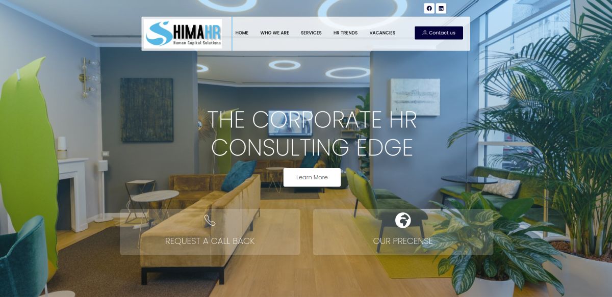
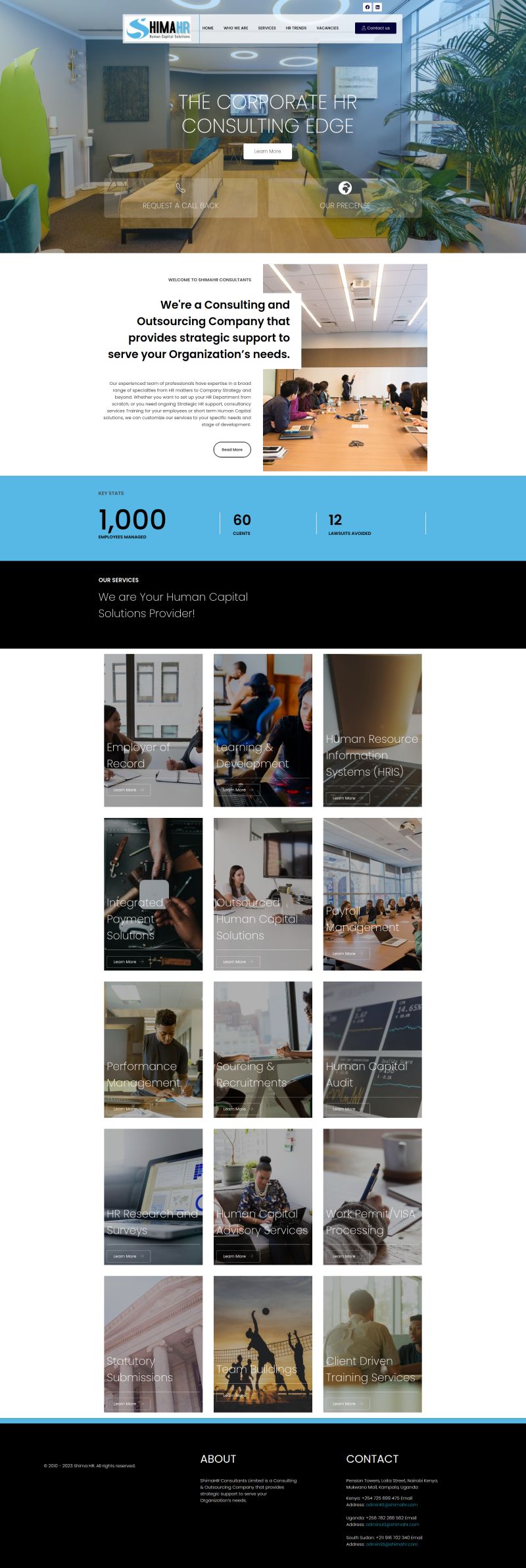
From Outdated to Outstanding: How Shima HR’s Website Got a Bold Upgrade
Shima HR is a game-changer in Human Capital Management, allowing businesses to focus on what truly matters—their growth.
But their old website wasn’t doing them justice. It lacked the energy, clarity, and professionalism that matched their expertise.
So, we got to work.
✔ A vibrant, personality-packed design that reflects Shima HR’s dynamic brand.
✔ A smooth, intuitive layout to guide visitors effortlessly through their services.
✔ A fresh, modern aesthetic that positions them as industry leaders.
Now, ShimaHR.com is more than just a website—it’s a powerful business asset that engages clients and showcases their expertise.
Click here to check out the website.
Does your website truly reflect your brand’s value? If not, let’s fix that.
Click here to Book Your FREE Website Consultation Right Now.

"Great Follow-Up & Feedback”
Thomas actually delivered on our concept plus he offered good training & intensely followed up with me even with my busy schedule till the project was done. If you are looking for a professional web consultant do check him out.
Naomi Ndirangu
Holy Family Basilica
African Union of the Blind (AFUB)
Non-governmental organization, dedicated to supporting blind and partially sighted individuals throughout Africa.
A Website That Truly Serves: How AFUB Transformed Its Online Presence
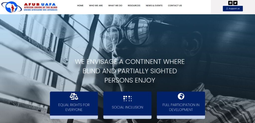
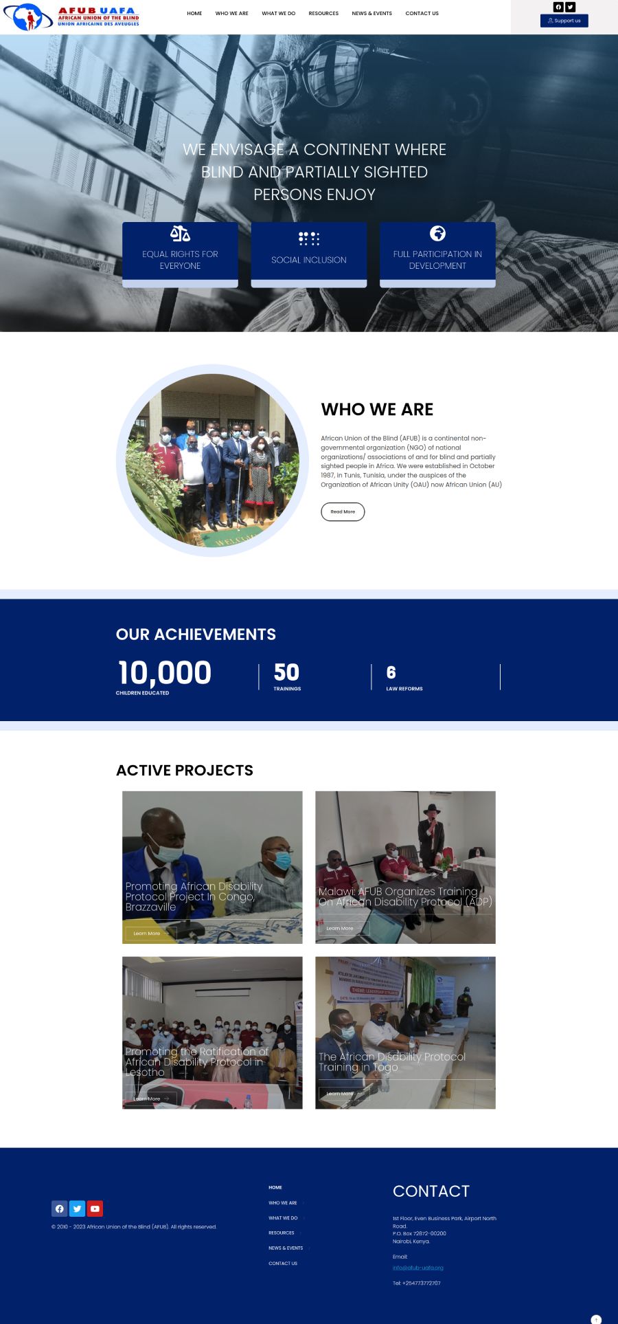
AFUB is on a mission to empower blind and partially sighted individuals across Africa—but their old website wasn’t reflecting that impact.
They needed a platform that wasn’t just informative but fully accessible to everyone.
So, we stepped in and delivered:
✔ Built-in text reader for seamless access by blind and partially sighted visitors.
✔ Updated, well-organized content to keep information relevant and easy to find.
✔ A streamlined, user-friendly structure for effortless navigation.
Now, AFUB-UAFA.org is more than just a website—it’s a fully accessible digital hub that aligns with their powerful mission.
Click here to check out the website.
Does your website truly serve your audience the way it should?
Let’s make it happen. Book a call today.
Click here to Book Your FREE Website Consultation Right Now.
"Tom is able to come down to your level for people who are not so tech-savvy”
Thomas is approachable & is able to come down to your level for people who are not so techno-savvy.
He also made himself very readily available during the entire duration of the project & we like our new simple colorful website.
Bernard Kithusi
Christian Life Community
JMK ADVOCATES
Corporate & Commercial Law Firm
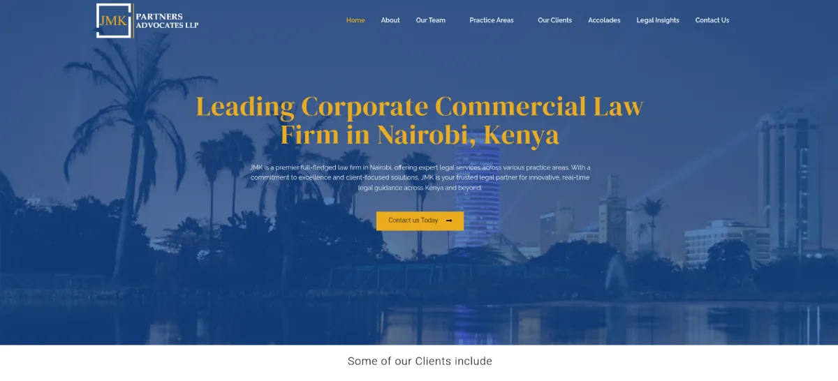
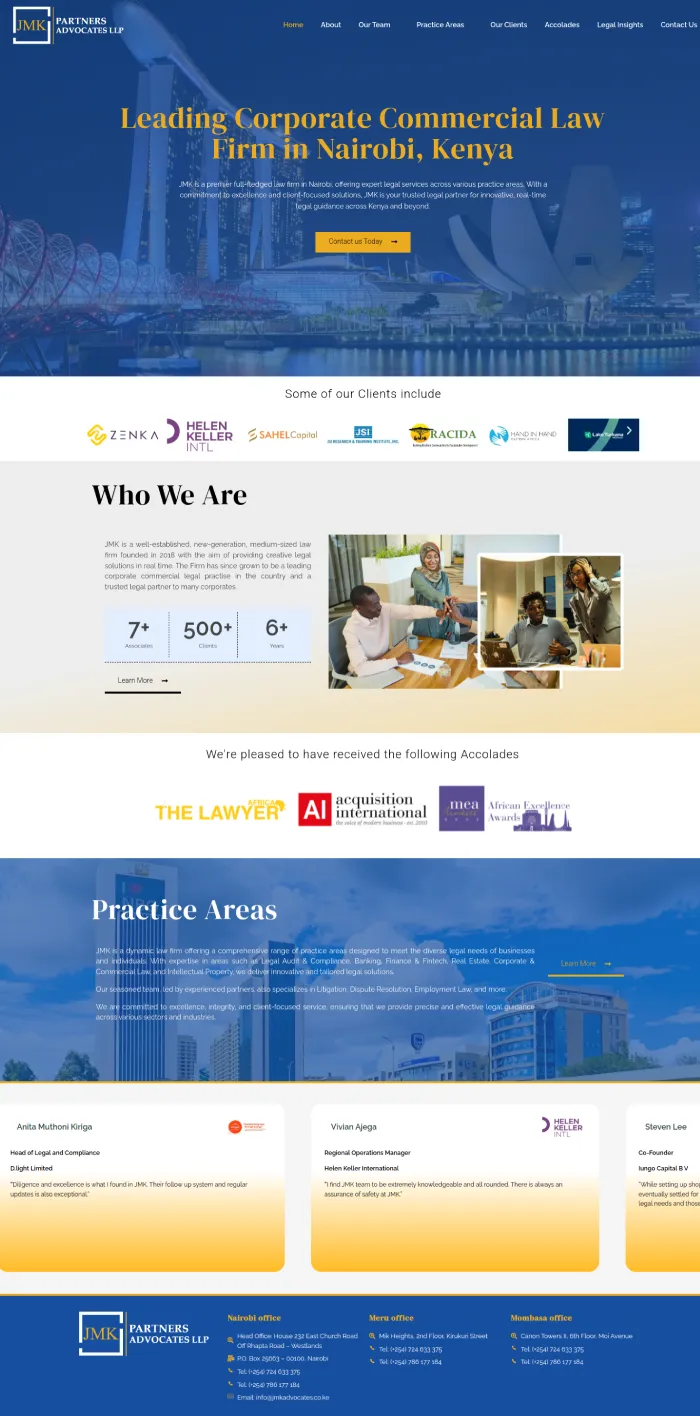
From Outdated to Elite: How JMK Partners Advocates’ Website Became a Digital Powerhouse
JMK Partners Advocates is a legal powerhouse, trusted by top-tier clients locally and internationally. But their website? It was holding them back.
Stale content. Sluggish response times. A lackluster online presence.
For a firm of their caliber, this wasn’t just a website issue—it was a credibility killer.
So, we stepped in.
We didn’t just redesign their site. We transformed it into a prestige-driven, high-performing asset that:
✔ Captivates from the first click with a sleek, modern homepage.
✔ Builds trust instantly with client logos, testimonials, and accolades.
✔ Keeps content fresh with a dynamic news feed and instant updates.
Now, JMK’s website doesn’t just exist—it commands respect, attracts clients, and reinforces their authority.
Click here to check out the website.
Your website should do the same. Let’s make it happen.
Click here to Book Your FREE Website Consultation Right Now.
"We Transformed Our Dream Concept Into Reality”
We had a rough concept of what we wanted and Thomas helped us get clear, he was patient and ready to advise us along the way, we are happy with our website because it was the concept we had wanted. He also kept to the deadline he’d set and was very punctual. Thank you Thomas.
Eliud Kimani
Ruaraka Academy
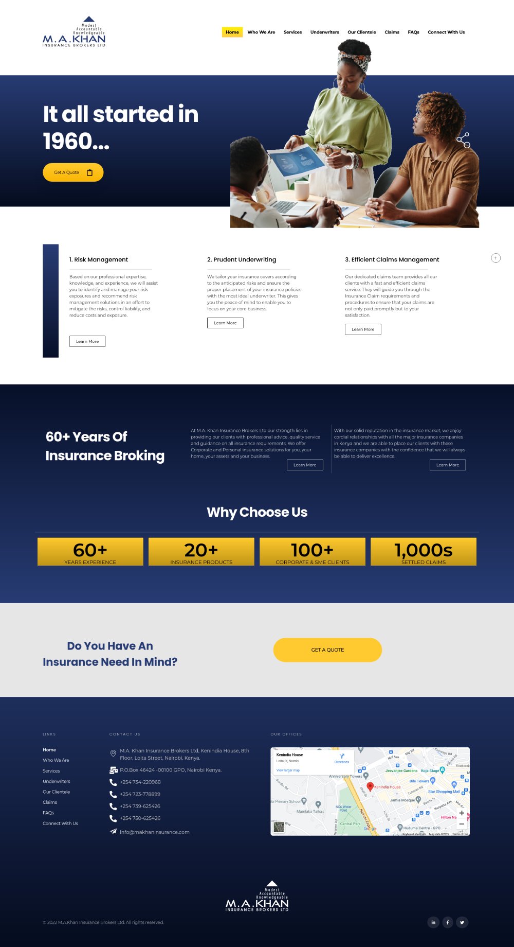
M.A. KHAN INSURANCE BROKERS
Insurance Brokerage Website Design
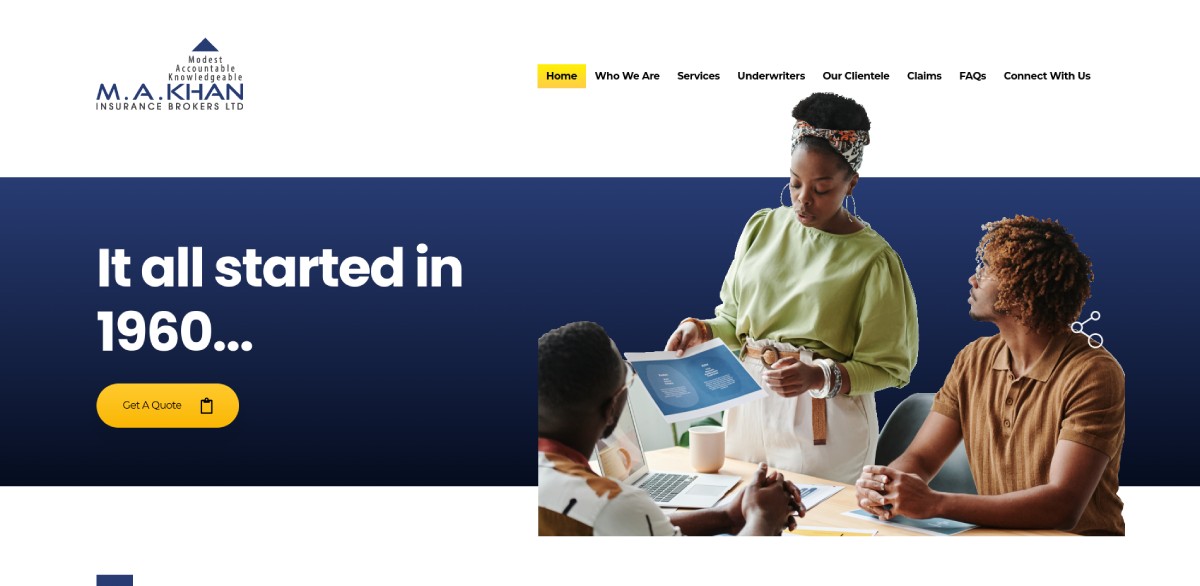
How M.A. Khan Insurance Brokers Revamped Their Website for a Modern Digital Experience
With 60 years of expertise in insurance brokerage, M.A. Khan Insurance Brokers needed a website that reflected their legacy while embracing modern digital expectations.
They wanted a fresh, vibrant design that would:
✔ Enhance their online presence and credibility
✔ Improve user experience for their clients
✔ Optimize for mobile to reach a broader audience
✔ Boost search visibility on Google
Here’s how we made it happen:
🎨 Modern, Vibrant Design that reflects trust and professionalism
📱 Fully Mobile-Optimized for seamless browsing on any device
⚡ User-Friendly CMS to make content updates quick and easy
🔍 SEO-Optimized to improve visibility and attract more visitors
The result? M.A. Khan Insurance Brokers now has a high-performing website that serves both new and existing clients with ease.
Click here to check out the website.
Could your website use a transformation? Let’s talk. Book your free consultation today!
Click here to Book Your FREE Website Consultation Right Now.
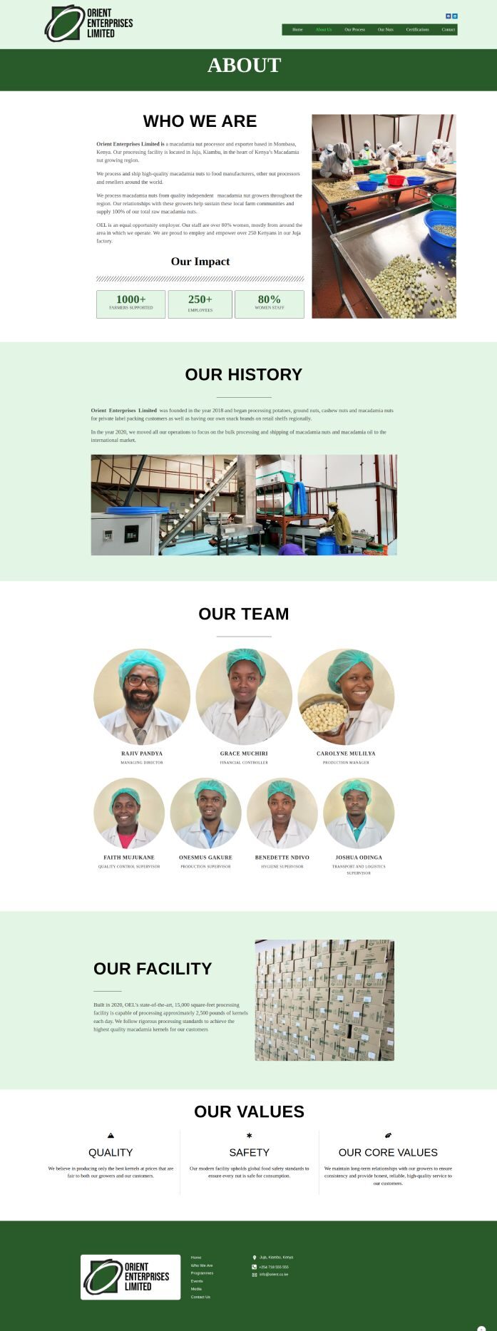
ORIENT ENTERPRISES
Macadamia nut manufacturer website Design
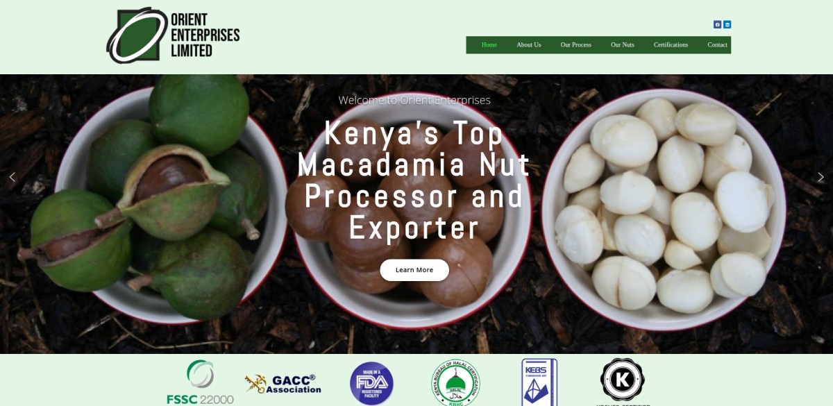
How Orient Enterprises Ltd Transformed Their Website to Attract Global Importers
Orient Enterprises Ltd, a leading manufacturer of Macadamia nuts, needed a website that would:
✔ Resonate with international importers and showcase their premium products
✔ Build trust and confidence with potential clients
✔ Highlight their expanded product line of seven different styles of Macadamia nuts
Our Approach:
🌍 Global Appeal: A sleek, professional design that speaks to the international market
📸 Product Showcase: High-quality visuals that highlight the premium quality of their macadamia nuts
🔍 Optimized for Search: SEO strategies to increase visibility among global importers
💼 Trust Indicators: Certifications, testimonials, and company history to establish credibility
The result? A powerful online presence that positions Orient Enterprises Ltd as a trusted exporter of high-quality Macadamia nuts.
Click here to check out the website.
Could your website help you reach a global audience? Let’s discuss how we can make that happen!
Click here to Book Your FREE Website Consultation Right Now.
AFRICA GOSPEL CHURCH
A church tracing its roots back to the work of missionaries from World Gospel Mission starting in 1905.
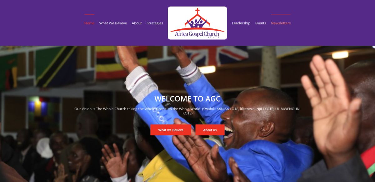
When Africa Gospel Church (AGC) approached us, their website no longer reflected their vibrant ministry. It was outdated, hard to navigate, and didn’t effectively serve church members or potential donors.
AGC needed a modern, engaging site that made it easy for visitors to find information, connect with ministries, and support their mission.
We revamped the website with a clean layout, vibrant visuals, and streamlined navigation to enhance the user experience. The content was updated to ensure relevance, and we optimized the donation process to make giving seamless.
Now, AGC has a dynamic online presence that truly embodies their mission—welcoming, inspiring, and easy to explore.
Click here to check out the website.
If your organization needs a website that connects, informs, and drives action, let’s chat!
Click here to Book Your FREE Website Consultation Right Now.

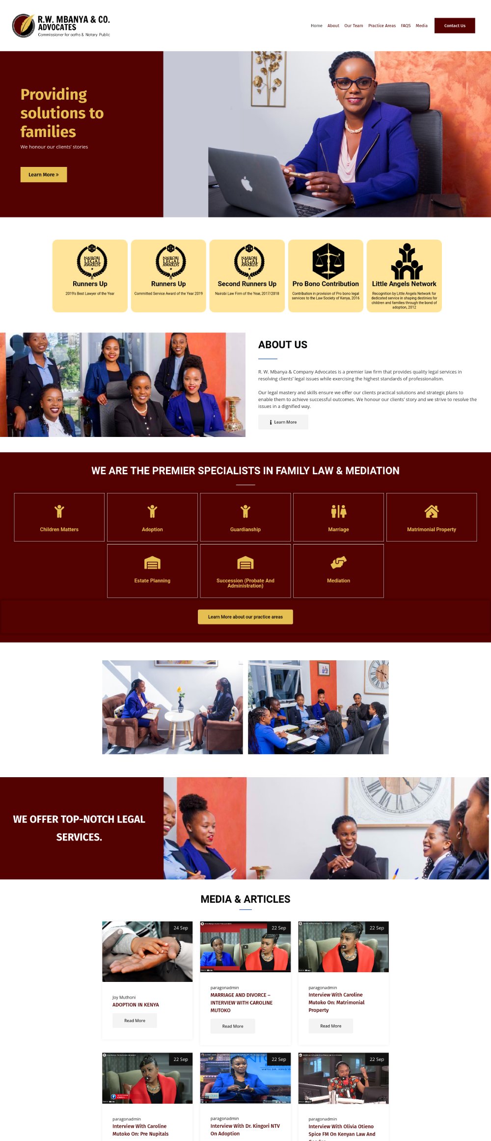
R.W. MBANYA & CO. ADVOCATES
Family Lawyer Website Design
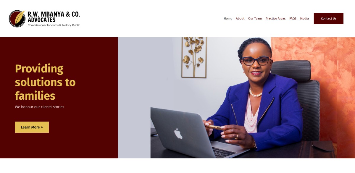
Objective: Family lawyer that needed a website that showcased their unique identity and highlighted their distinctive position in the legal landscape.
Overview: R.W. Mbanya & Co. Advocates needed a website that showcased their unique identity and highlighted their distinctive position in the legal landscape.
We had the pleasure of working with R.W. Mbanya & Co. Advocates to revamp their website and photography. Our goal was to create a platform that truly captured who they are and what sets them apart in the legal industry.
Link: rwmadvocates.com
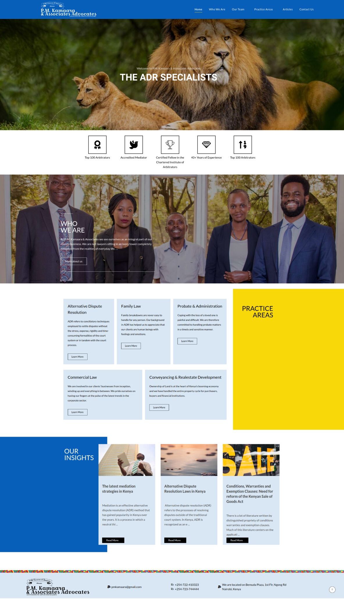
P.M. KAMAARA & ASSOCIATES ADVOCATES
Alternative Dispute Resolution Firm Website Design
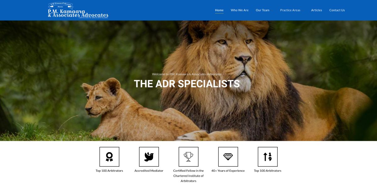
Objective: Alternative dispute resolution law firm that was looking to redesign the look of their website + showcase new services.
Overview: P.M. Kamaara, a reputable law firm specializing in alternative dispute resolution, approached us to redesign their website. Over the years, the firm had undergone significant changes in their strategic direction, primarily focusing on alternative dispute resolution practices. To align their online presence with this new focus, they sought a website that effectively communicated their updated services and showcased unique design elements that represented their brand identity.
Link: www.pkamaara.com
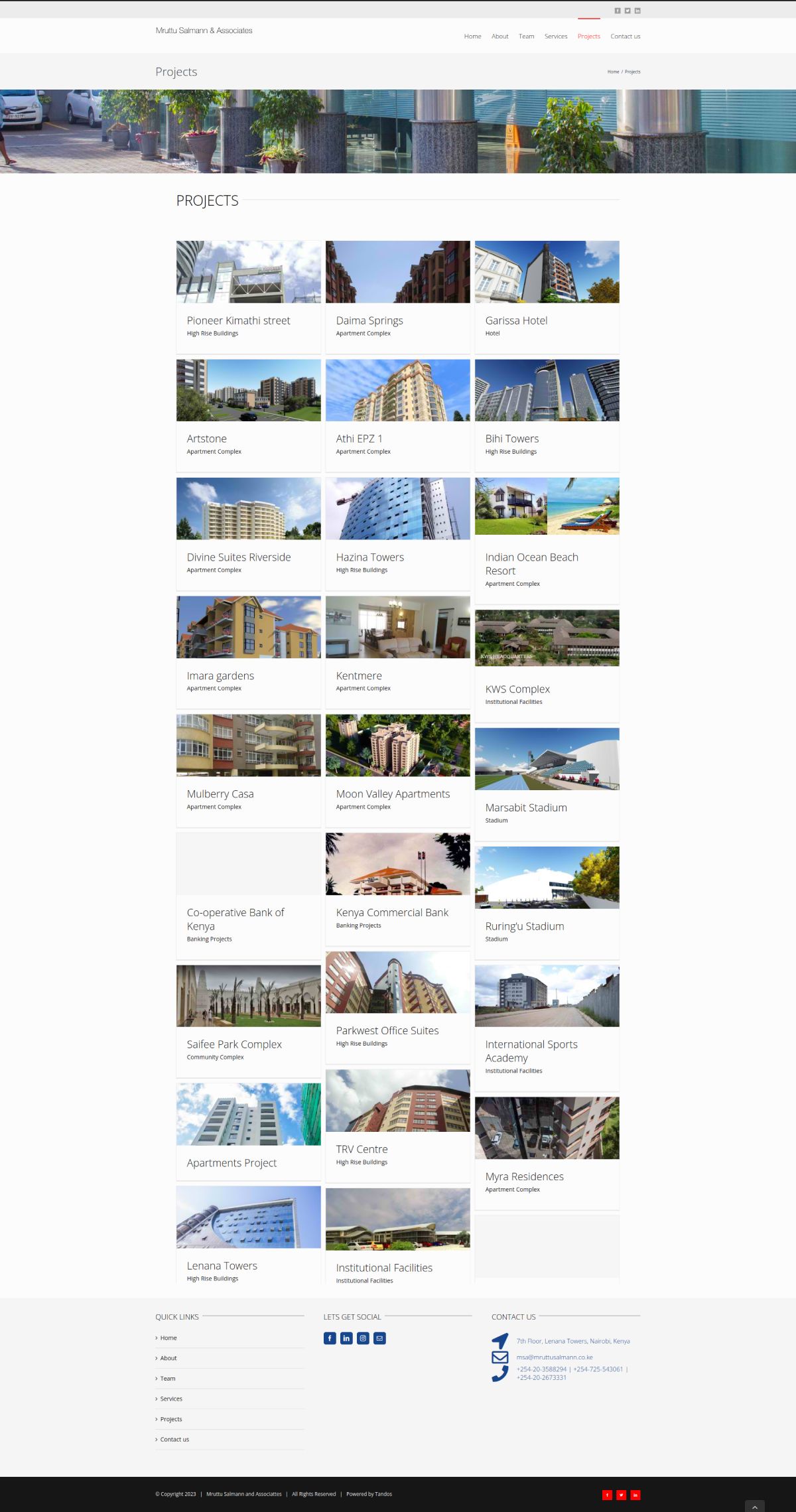
MRUTTU SALMANN ARCHITECTS
Architectural Firm Website Design
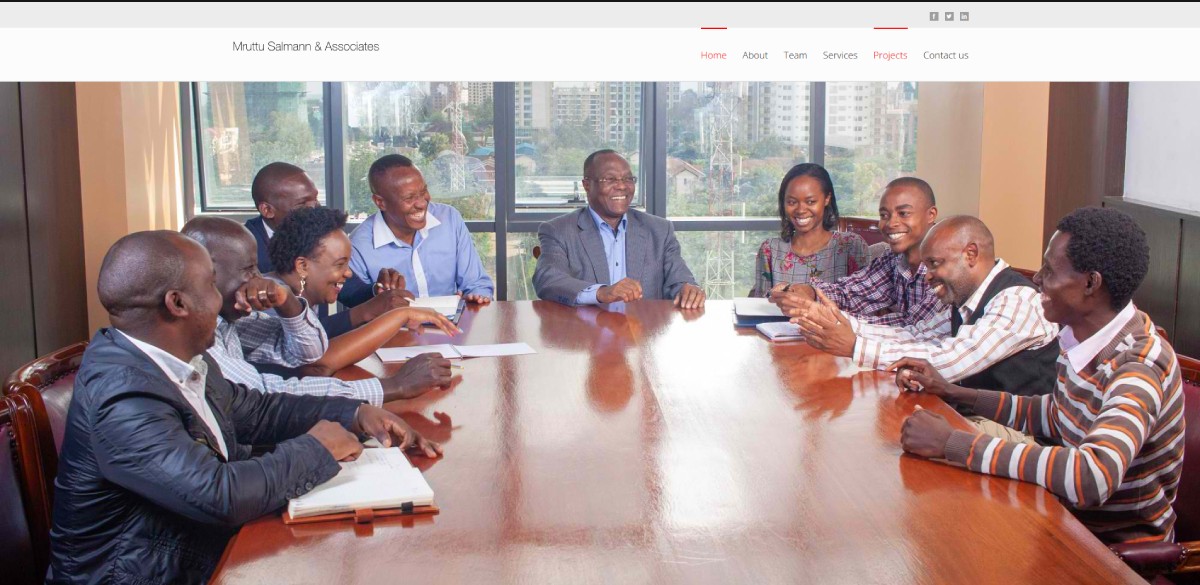
Objective: Architectural firm that had a clear vision in mind for their website. They wanted it to be light, airy, and modern, with a color scheme featuring soft greys and blacks.
Overview: We were excited to bring their vision to life and create a website that truly reflects their unique style.
We took great care in crafting a design that is both sleek and inviting.
The combination of light greys and blacks gives the website a contemporary and sophisticated look that instantly grabs attention.
Link: mruttusalmann.co.ke
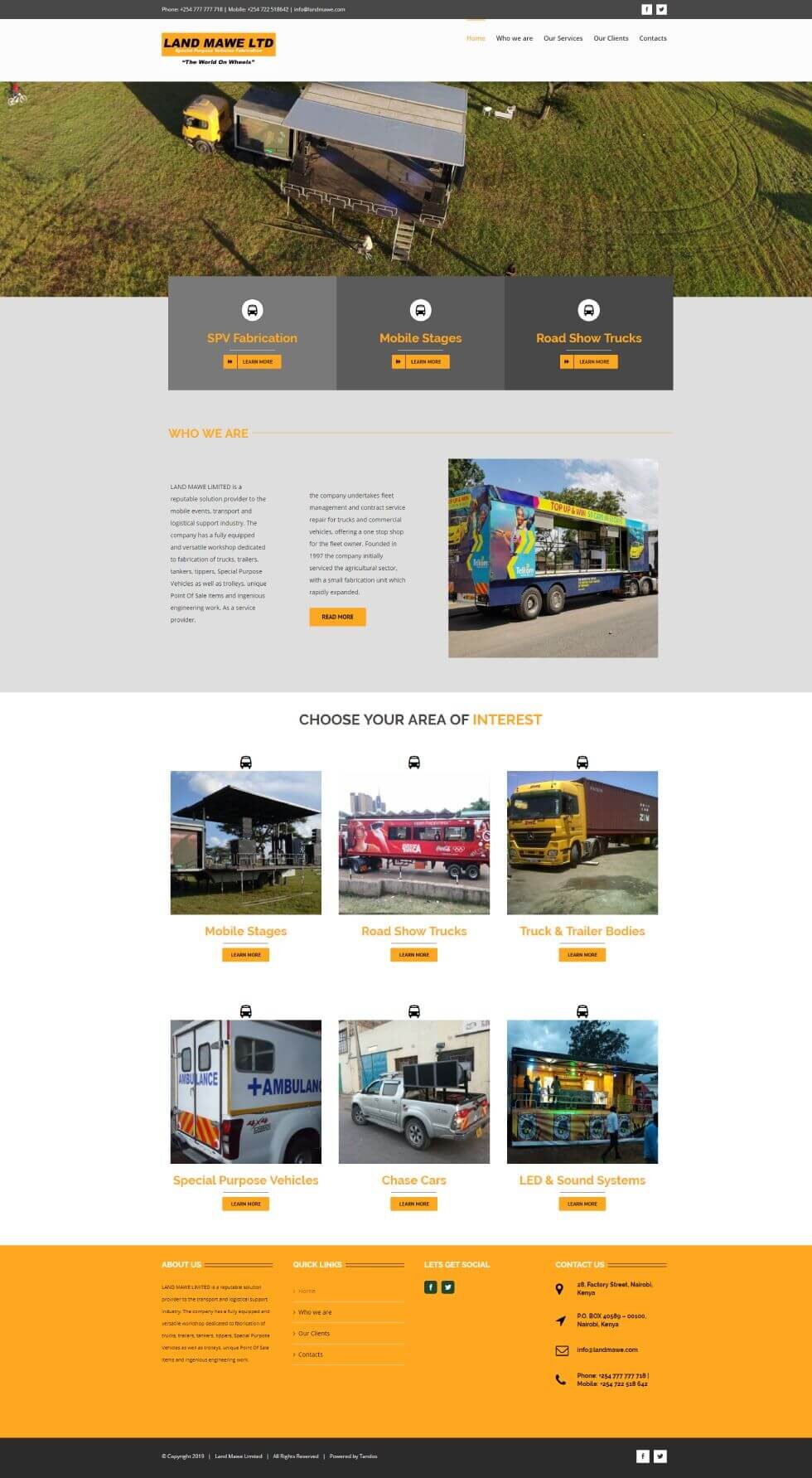
LAND MAWE LTD
Vehicle Fabrication Firm Website Design
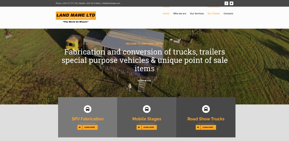
Objective: Fabricating firm that needed a makeover to truly showcase their incredible services and un-featured projects.
Overview: Land Mawe Ltd is a company that deals with the fabrication of trucks, trailers, tankers, tippers – they had an outdated website that didn’t capture their latest services + projects.
Together with the Land Mawe team, we set out to create a fresh and inviting website that would breathe new life into their online presence.
We wanted to capture the essence of their craftsmanship while making it easy for potential customers to find exactly what they were looking for.
Link: landmawe.com
